The Problem
Computational biology tools are powerful but painful to use. Scientists rely on software that handles complex molecular workflows—generating molecular variations, analyzing enzyme bindings, visualizing 3D protein structures—but the interfaces look like Windows from 2005. Users tolerate poor UX because they need the functionality, but they shouldn't have to choose.
Biovet set out to build a modern interface for molecular design and binding analysis, making it possible for biologists to run AI-guided workflows (molecule generation, structure visualization, enzyme binding analysis, interpreting ML outputs) without needing to understand the underlying machine learning.
The Design Challenge
Take a computational workflow that's inherently complex and make it feel coherent:
Molecule management: Select from existing molecules, generate variations, compare results
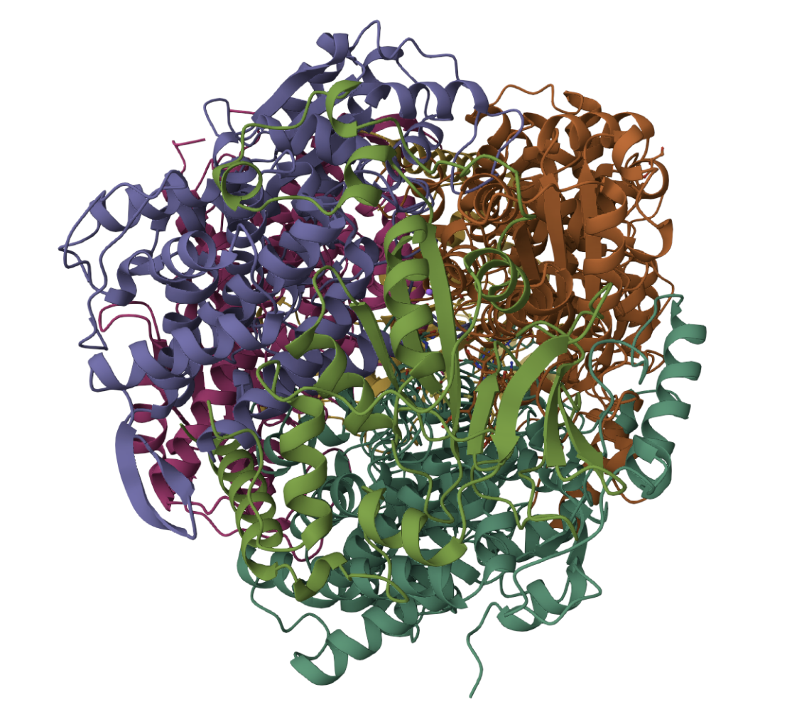
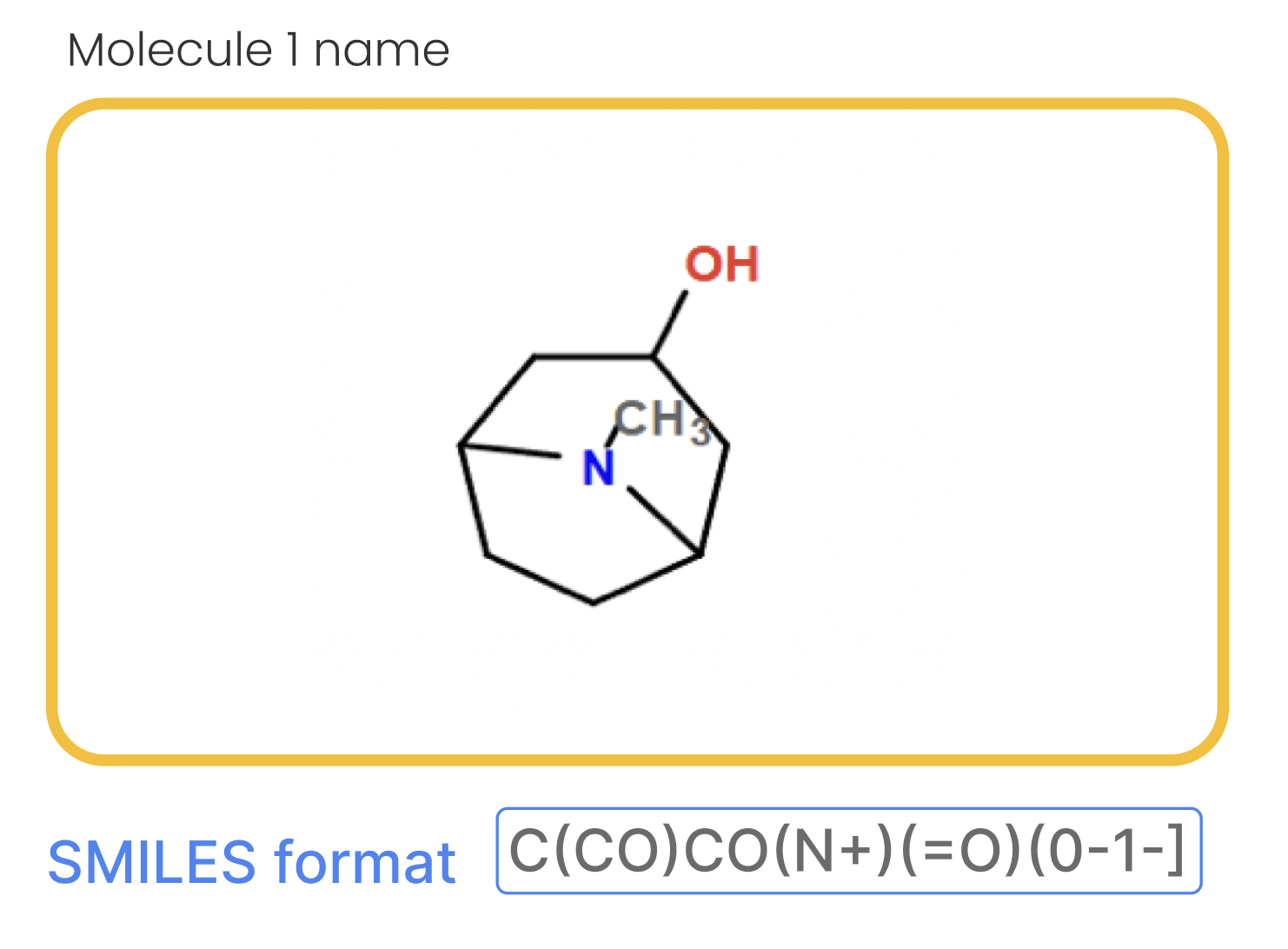
Structure visualization: Display 2D chemical structures (SMILES notation) and 3D protein binding surfaces
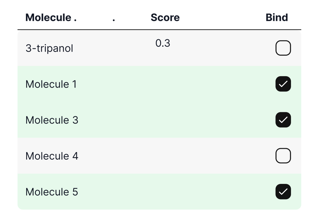
ML interpretation: Show ranked results with binding scores that users without ML expertise can trust and act on
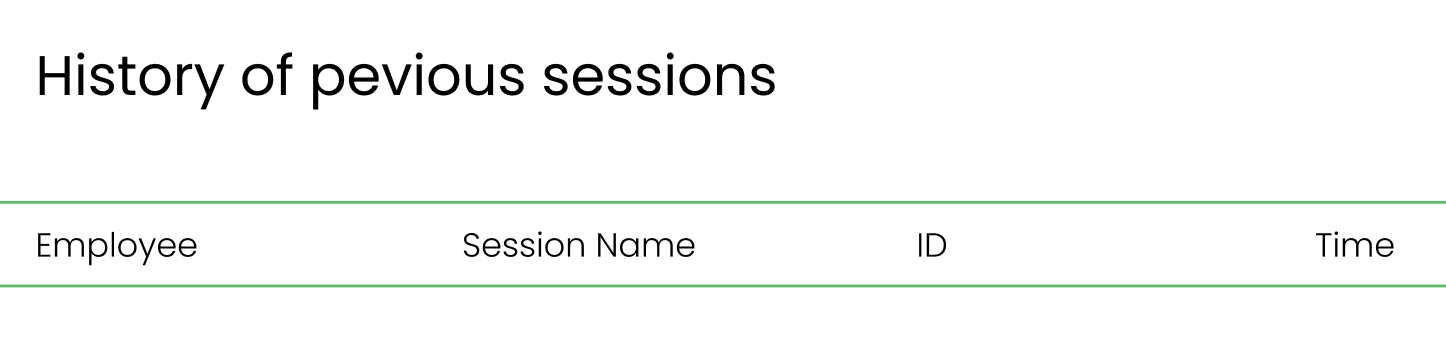
Session management: Track experimental iterations so users can compare results across runs
Domain expertise: Assume users are biologists, not engineers—clarity and trust matter more than feature density
The Approach
I conducted competitive analysis across existing computational biology platforms and identified a pattern: powerful functionality paired with confusing workflows. Most tools felt like they were built by engineers for engineers, not for domain experts who needed clarity.
The insight: this wasn't a technology problem, it was a design problem. The workflows could be dramatically simplified by:
Removing unnecessary steps — streamline from "select molecule → generate → analyze" to one coherent flow
Making outputs trustworthy — show binding scores with context (rankings, historical comparisons) so users understand what the numbers mean
Progressive disclosure — let users start simple (select, generate) then go deeper (view 3D structures, adjust parameters) only when needed
Visual hierarchy — molecule structures and binding analysis are the stars; everything else supports them
What I Designed
Session Setup
Simple entry point: name the session, start the experiment
Option to load previous sessions for comparison
Molecule Generation Workflow
Dropdown selection from predefined molecule database
Real-time 2D visualization of selected molecule
One-click generation of similar molecules
Output: ranked list with similarity scores
Binding Analysis
Multiselect molecules to test
Enzyme/protein target selection
3D protein structure visualization showing binding sites
Ranked results with binding scores and visual rankings
SMILES notation displayed for technical documentation
Key Design Decisions
Color-coding for interpretation: Green for positive actions (Generate, Show Bindings, Save), neutral tones for data display
Consistent molecule visualization: 2D and 3D representations consistent across the flow so users build mental models
Score as context, not just numbers: Ranking lists show relative performance, not just raw values
Comments section: Allow researchers to annotate findings alongside experimental results

What this taught me
1. Domain understanding beats convention Most SaaS design conventions don't apply in computational biology. Users tolerate workflows that would be unthinkable in consumer apps because they're solving real scientific problems. The design job isn't to make it "beautiful," it's to make it trustworthy and clear.
2. Competitive analysis reveals gaps I didn't do extensive user research; instead, I studied what users were currently doing with existing tools. Their pain points were evident: they used clunky interfaces despite better alternatives existing because the alternatives weren't any better designed.
That's where the opportunity was.